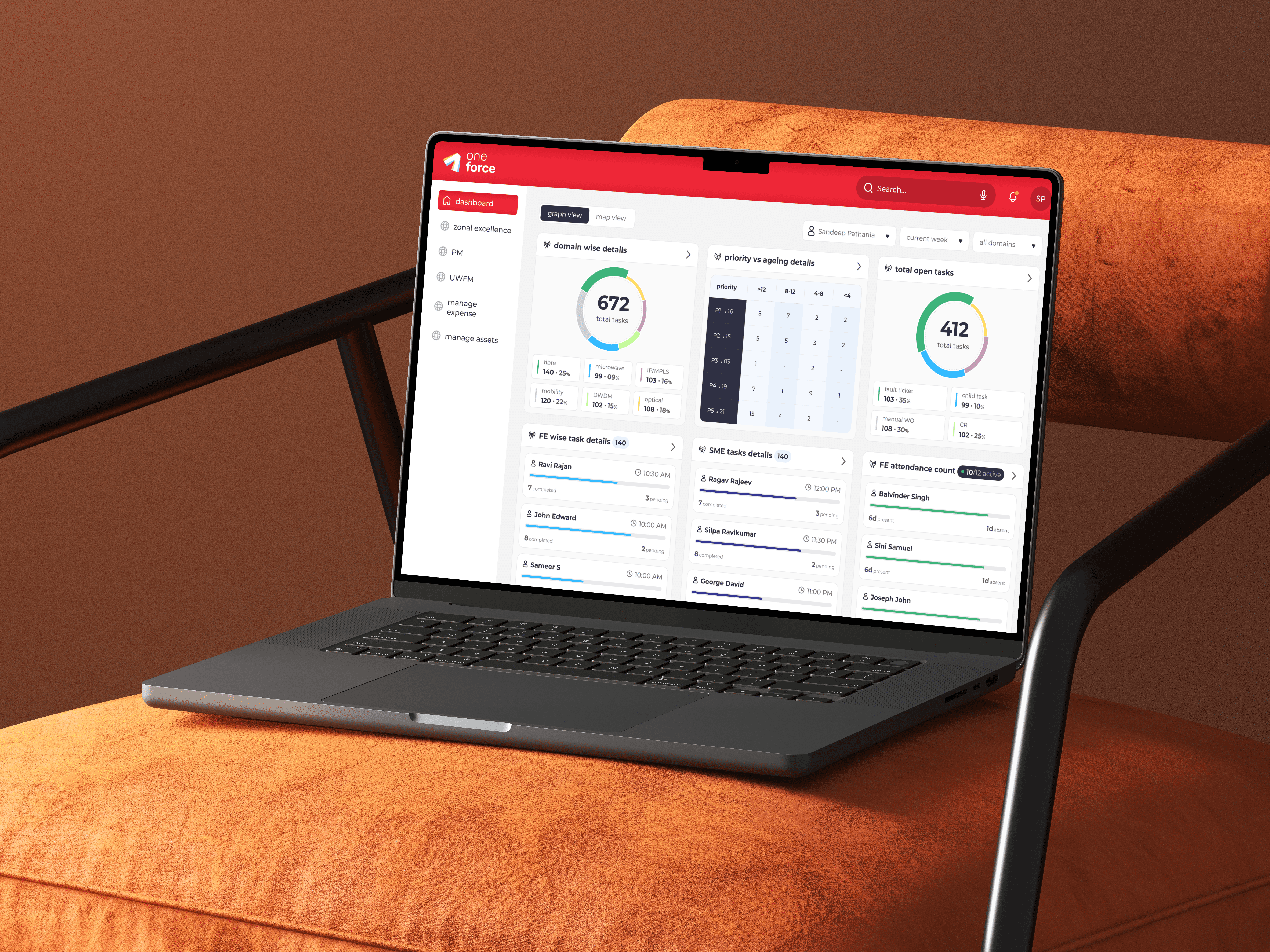
Cut a 3.5 hour Monday review to 90 seconds at L&T Finance
Client: L&T Finance is one of India's largest lenders operating without a bank licence, closest in type to OneMain Financial, lending across 200,000 villages and more than 100 cities.
(role)
Sr. Product Designer
Owned design end to end: audit, research, IA, testing, prototyping and handoff.
(SERVICES)
Enterprise SaaS Financial Services Data Visualization
(TIMELINE)
2 months
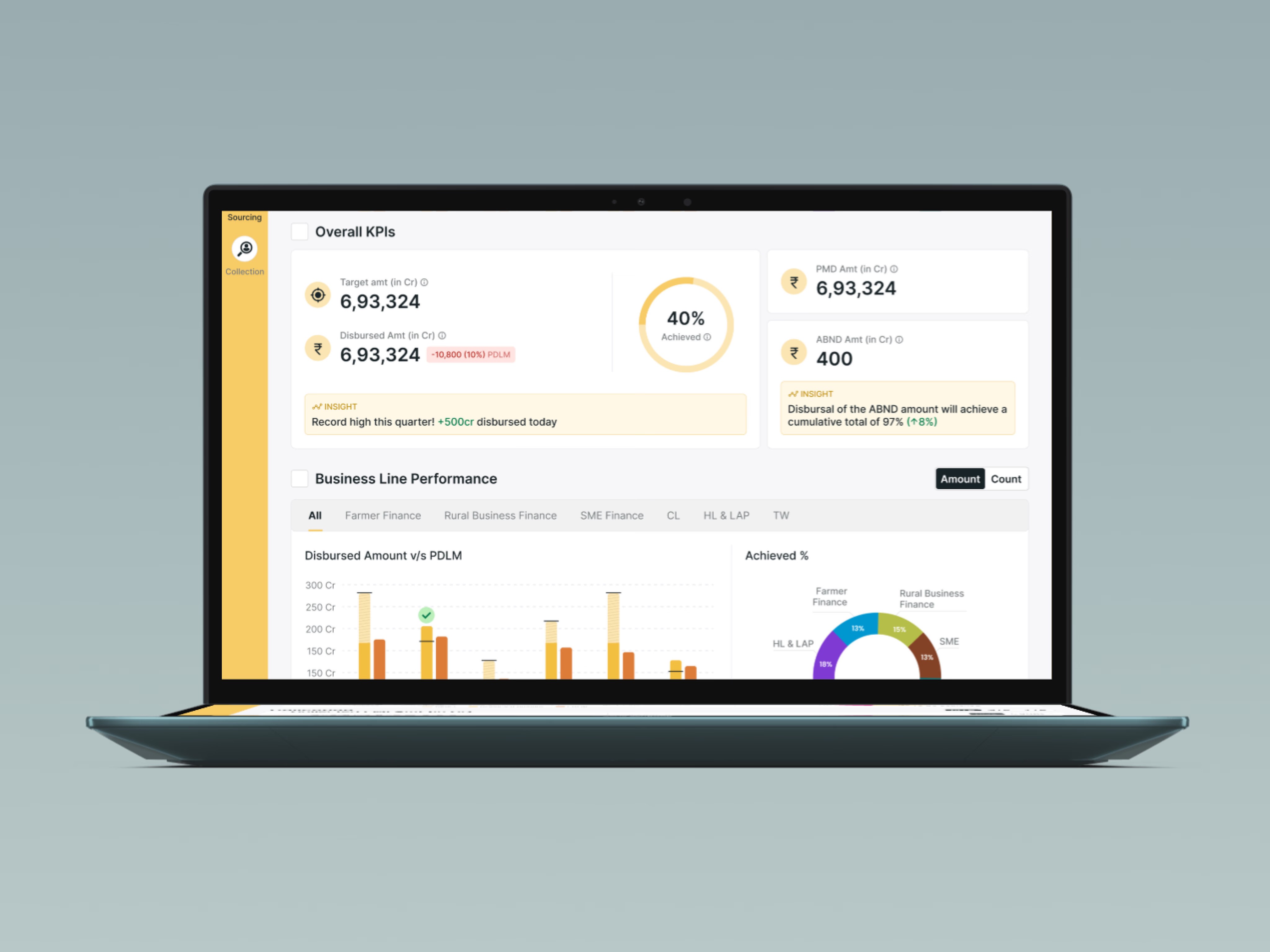
(Overview)
The goal was to let a regional manager read his whole region in one sitting. The numbers were already on a screen every morning, sitting as 14 cards in no particular order, so managers gave up and rebuilt the picture in Excel by hand. I audited that screen, found the order people actually read in, and designed the platform around it.
(result)
27%
Increase in collection efficiency
90 sec
Monday KPI review, down from 3.5 hours
35%
Drop in manual data entry errors

Before: Rural Business Finance Excel
After: LNT Finance Operations Dashboard
Let's break down the problem
(Problem 1)
Money out, money back.
A lender gives money out and gets it back on time. A regional manager is judged on both, every month, across 5 lending businesses. A farmer loan and a home loan do not behave the same way, so a number that reads as healthy in one is a warning in the other.
He reads a region as a chain: how many applied, how many were approved, how that tracks against target, how much went out. The live screen scattered those 4 steps across 14 identical cards, so the chain stayed in his head.
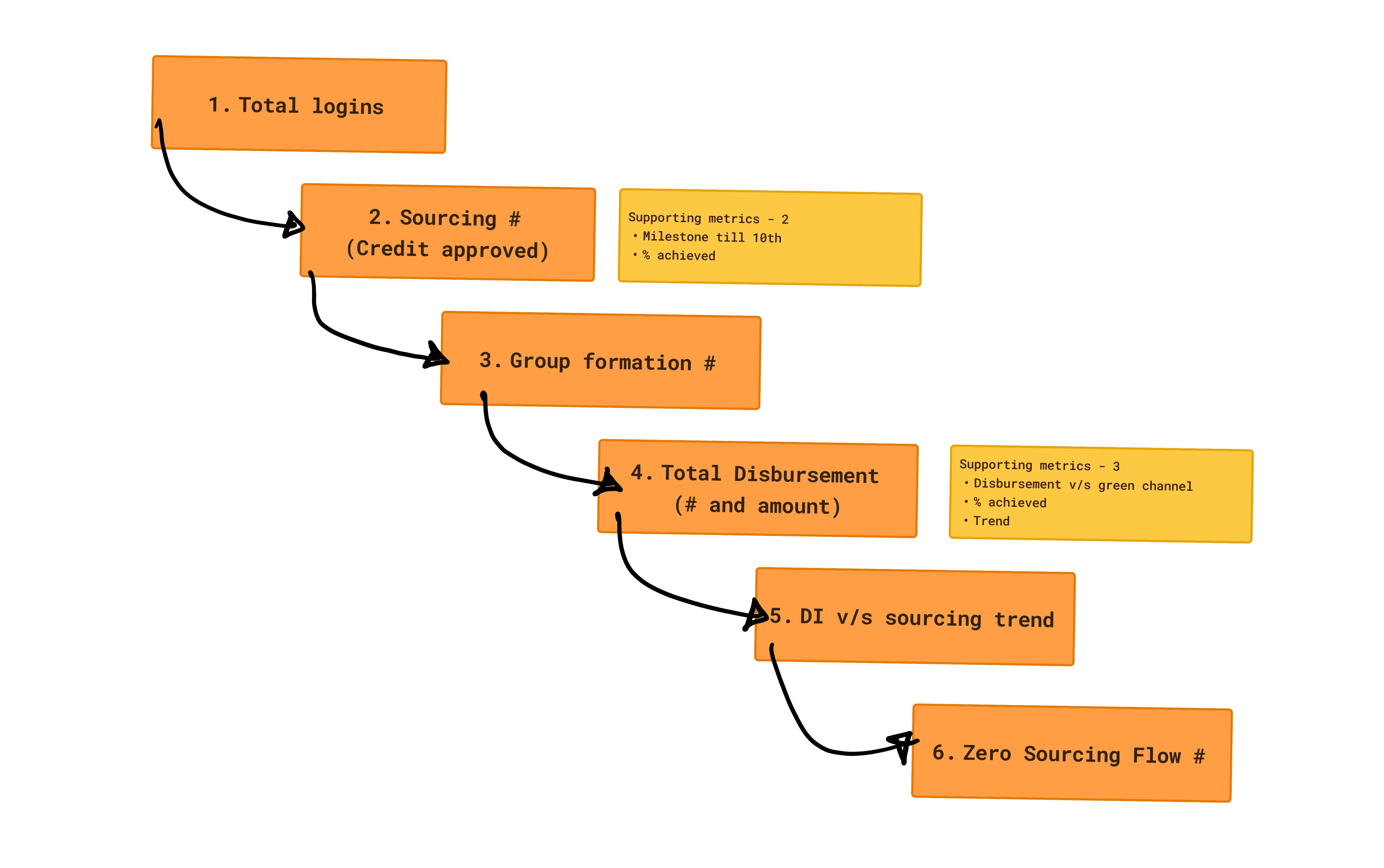
Regional manager's mental model: a linear flow

How regional manager actually read the dashboard
(Problem 2)
So he went back to Excel.
When the screen is slower than doing it by hand, people do it by hand. 12 files, refreshed Thursday, read Monday.
Merging them took 30 minutes. Chasing missing numbers from field officers, 45. Emailing district heads once he found the data was 4 days old, 45. Reconciling 6 replies, 2 of them contradictory, 45. Formatting a deck, 45. Only 30 of those 210 minutes touched the data.
210 minutes every Monday. 182 hours a year spent building the picture, not running the business. Only 30 minutes went to the data. The other 180 went to checking if it was trustworthy.
(Process 1)
The audit, before any design
Lending was new to me, so I learned the vocabulary from the people using it: what PDLM, ODD and cycle clearance mean in practice, and for which of the 5 business lines.
Then I went through the live Qlik screen card by card and wrote the audit onto it. Three notes kept repeating. A KPI sitting outside the step it belongs to. A number with nothing to compare it against. Two columns reporting the same thing in different units.
Every number was correct. The screen just never decided what the reader should do with them. Those three notes became the three things I changed.

Understanding Technical Subject Matter Through Conversations
(Process 2)
Wireframing the order, not the screens
Grey boxes, no colour, so the only thing anyone could react to was the sequence.
Three tiers read the same business differently. Leadership wants the national aggregate, zonal heads want comparison and geography, field managers want the task in front of them. The obvious answer was one dashboard for everyone, and I argued against it. What shipped is one structure that opens at the level you sit in.

Simple wireframes to test the flow, not the visuals.
(User Goals)
As a regional manager, I want my whole region on one screen without calling anyone, so I can act on a shortfall while the month is still open.

Regional Manager
As a business head, I want the screen to read in the order I already think in, so I am not assembling the story myself every morning.

National Business Head
(Iterations)
1. Counts only 🚫
Overdue accounts and outstanding amount, the way the spreadsheet already reported it. He can see how much money is stuck, not which line is in trouble, because counts follow portfolio size, not health.
HL & LAP shows 15141 and is performing better than a line showing 5452. Nothing here ranks, so the decision stays where it was.
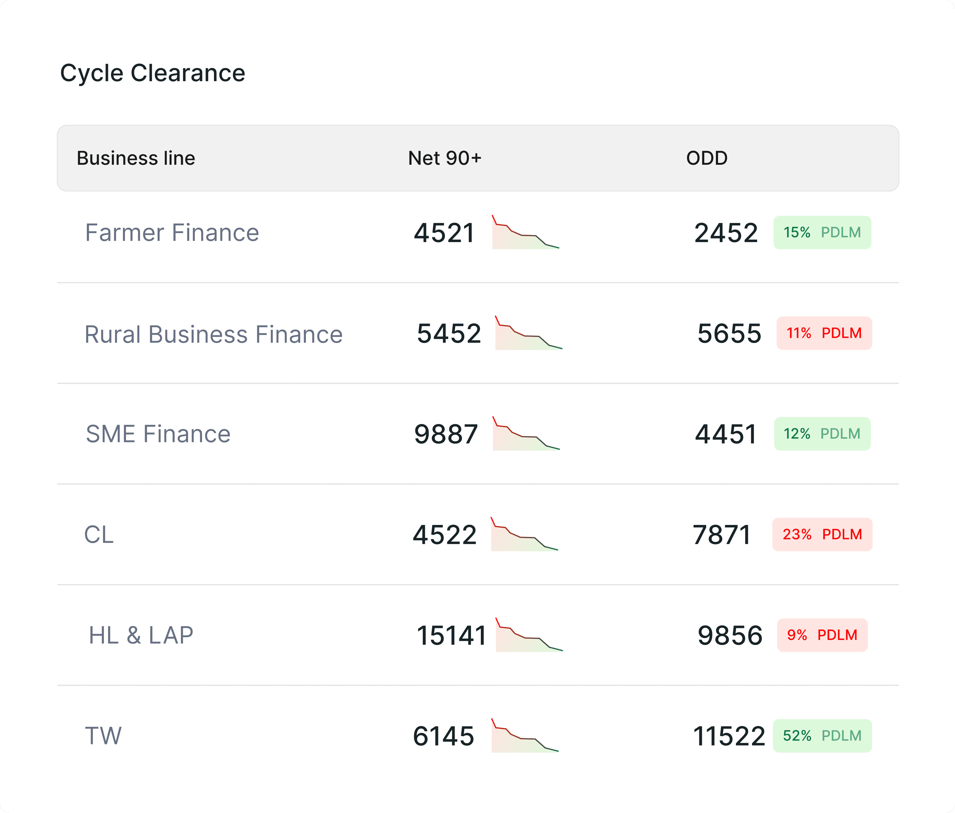
2. Rate plus volume in one bar 🚫
The missed payment rate fixed the ranking. But the bar behind it ran on its own scale per row, in 6 colours that carried no meaning, and in testing a manager read the longest bar as the worst line. It was not.
The trend was gone too, so a rate falling from 30% and one climbing from 18% both arrived as 24%. He can rank, but not judge size or direction.

3. Rate first, then scale, then direction ✅
Each column does one job and hands to the next. Rate first, coloured against threshold, so 6 lines rank in about a second. Then accounts with a trend line, so the number carries a direction. Then outstanding amount for scale. Then movement against last month.
He reads left to right: how bad, how many, how much, which way, and knows which line to visit before finishing the first column. Colour appears once, on the rate, so it still means something.
Four principles held every screen to it. Role first: 3 tiers, 3 entry points, one system. Priority surfaced: the number that is off target is visible without scrolling. Field ready: 44px touch targets, offline tolerant caching, contrast that survives sunlight. Modular scale: role permissions sit inside each component, so a 6th business line is configuration, not a redesign.

(Learnings)
1. Most of that Monday was not spent assembling numbers, it was spent deciding whether to believe them. So every screen states how fresh its data is before it states anything else.
2. Mobile shipped 2 of the 6 zones, sourcing and collections. Attendance, risk, team views and support stayed on desktop. A field officer in a village does not need a national comparison, and cutting mobile down is what let the field tier ship at all.
(Solution 1)
1. Twelve files to one screen
Everything a manager opened 12 files to assemble now sits in one place: target against disbursement, collections against billing, and where each of the 5 lending lines stands against its own number. Grouped the way the business runs rather than the way the data is stored, sourcing then collection, with month to date and quarter to date as a toggle instead of a different report.
Access is role aware: the screen opens pre filtered to your region and tier, and drills national to state to district to manager without a reload. The same screen runs on the phone, because the review happens at a desk and the rest of the day does not.
Web: the full region, sourcing and collections in one place.
The same region on a phone, for the rest of the day.
(Solution 2)
2. A wall of numbers to a funnel
Issue from the audit: high cognitive load. A manager had to scan the whole screen to assemble one insight.
The 14 cards became a KPI narrative ordered by business priority, from applications through credit approval and achievement against target to disbursement. Each number sits next to the one it comes from, so the chain is on the screen instead of in his head, and the block ends on a written callout rather than a number.

Before: 14 cards, no reading order.

After: the same figures as a funnel, ending on the callout that explains the move.
(Solution 3)
3. A number to a number in context
Issue from the audit: no context. A figure with nothing to compare it to tells you what happened, not whether it is good, so managers cross referenced past months by hand.
Now the chart type follows the data type, and every trend carries a benchmark indicator showing proximity to the monthly or quarterly target. The reader picks what to measure against: last month, best month, 3 month average, or target. Disbursement carries its achievement percentage on the same card, so the number arrives already judged.

Before: three months as three flat numbers.

After: one trend, measured against whatever the reader picks.
182 hours returned to every regional manager each year.
By replacing the 210-minute Monday reporting routine with a live dashboard, managers got their first insight in 90 seconds. Collection efficiency rose 27%, while manual data entry errors fell 35%.
(From the team)
"Working with Rachana on the L&T project was great. She quickly made sense of a complex business with multiple teams, business lines, and a lot of data. She kept bringing the conversation back to what users actually needed and took strong ownership from research through the final design."
- Dhisti Desai (Lead Designer)