Taking a classroom course online, at 1/5th of the price
Nata Ace Tutorial, an early stage test prep startup for NATA, India's national architecture entrance exam. Think of it as the SAT for architecture school, except it also tests drawing and spatial aptitude, and it is the only route into a five year B.Arch program. The company ran as a classroom operation in one Mumbai suburb.
(role)
Instructional & UX Designer
Owned end to end: research, curriculum architecture, content design, visual system.
(SERVICES)
Learning Systems Content Design Information Architecture
(Team)
(TIMELINE)
4 months

(Overview)
The course worked. It just could not travel. $960 a seat, 20 seats a batch, one classroom, while most of the students who needed it lived in cities with no test prep center at all. Moving it online meant designing in everything a teacher does live: the sequence, the pacing, the feedback. I had taught these students for three years, so I built that system, and the course shipped at $180.
(result)
25x
Students in one year, from 20 in a classroom to 500 online
81%
Lower price per student, $960 down to $180
61%
Carousel completion, against a 22% category benchmark
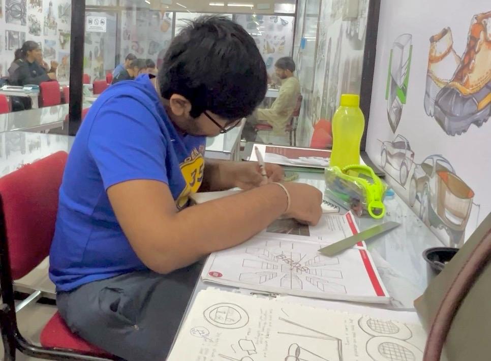
Before: 20 seats, one room, $960.
After: the same course, $180, anywhere.
Let's break down the problem
(Problem 1)
The students who needed it could not reach it.
A classroom course is capped twice. By the room, which holds 20, and by the price, which at $960 selects for students who were never the ones struggling.
Picture a kid preparing for the SAT in a town with no Kaplan and no tutor within driving distance. That is most of this market. I had taught NATA for three years and the pattern never changed: real ability, no structured path, and a quiet exit around week six, because nothing told her where she was or how much was left.

"I don't know what comes next, so I just watch a few posts and then leave." Class 12.
(Problem 2)
Recording the class would not have worked.
Every competitor had already tried it. Dense PDFs, lecture recordings, a classroom moved onto a screen, and the same drop off online courses are famous for.
What a recording loses is the teacher. In a room I decide what comes first, when to slow down, when to make someone redraw something. None of that is content. All of it has to be designed if it is going to survive without me, and designed once, because the whole business case was a course produced one time serving any number of students.
The exam covers 37 topics and nothing online put them in an order. Sequence, pacing and feedback were the product. The slides were just where they showed up.
(Process 1)
Three years in the room, then the interviews
I had taught these students for three years, so I did not start by discovering pain points. I started by checking which of mine held outside my own classroom.
Students in smaller cities gave three answers: no clear starting point, no feedback on practice work, and material written for students at expensive coaching centers rather than for them. Our own content audit added the structural half, inconsistent naming, no hierarchy, no progression signal anywhere. Every competitor was digitizing a classroom. Nobody was designing a course.
Student interviews and observations across non-metro classrooms.

200 Six months of production down to under two, which is how two people shipped 111 pieces., 4 domains, one dashboard
(Process 2)
Architecture before any visual work
I mapped the exam into 37 sequenced topics across 10 modules, with the same six phases in every topic: context, concept, application, refinement, practice, and extension.
With 37 topics × 3 formats = 111 content pieces, structural mistakes could cost weeks. I tested the reading order with hand drawn sketches and students, rejecting three layout approaches before visual design.
Using ChatGPT for drafting and iteration helped reduce the projected six month build to under two months and cut iteration cycles by 40%. The fixed structure made that possible: the model filled known slots instead of reinventing the layout each time.
(User Goals)
As a student with no test prep center near me, I want a course I can afford and follow on my own, so my preparation is not decided by my zip code.

NATA Aspirant, small city
As a two person company, I want to produce the course once and sell it anywhere, so growth is not capped by a room.

Founder
(Iterations)
1. The lecture, moved onto slides 🚫
The obvious first move, and what every competitor had done. It reads fine to a teacher, because the teacher paces it live. On a phone at 11pm it is an info dump. A student cannot tell what she is meant to remember, and nothing in it says where she is.
2. Split by topic, still no shape 🚫
Breaking the lecture into topics fixed the length but not the experience. Each topic was laid out on its own terms, so every one carried a fresh learning curve. Comprehension testing with 12 students showed the concept explainer landing somewhere different each time, and the first minute going on working out the format rather than the concept.
3. Six phases, every topic ✅
Context, concept, application, refinement, independent practice, extension. Same order, same slots, all 37 topics.
Version one had no shape. Version two had a different shape each time. What fixed it was one rule: each step does a single job, and nothing is introduced before the student can use it.
That rule is also what made the structure repeatable, which mattered at 37 topics and 111 pieces.

(Learnings)
1. Knowing your users already is not a substitute for research, it is a shortcut to the right questions. Three years of teaching told me which week students quit. The interviews told me why, and it was feedback on practice, not content quality.
2. The affordability came out of the architecture, not out of discounting. A course that only works with a teacher in the room has to be priced like one. Designing the teaching into the content is what let the price drop 81% without the course getting thinner.
(Solution 1)
1. A list of topics became a course
The week six exit came from three things: no starting point, no sense of progress, and no feedback on practice. Sequencing answers the first, so there is always a next thing. Progress markers inside the content answer the second, so a student can say how far along she is without asking.
And the refinement and practice steps answer the third, because a worked example that shows how points are awarded, followed by a mistakes to avoid list, is feedback arriving without a person in the room.
61% finished, against a 22% category benchmark.

Tablet view of the content.
Concept as video, recorded against the same slide system.
(Solution 2)
2. One visual system, so nothing has to be decoded twice
Students were spending time figuring out the format instead of the concept. It also felt inconsistent from one topic to the next. So I made colour carry meaning: blue for instruction, yellow for practice.
1 slide anatomy, 6 tokens, and 8 components kept the system consistent and readable across screens. The same structure also sped up production. ChatGPT helped cut the projected six month build to under two months and iteration cycles by 40%, enabling two people to ship 111 pieces across three formats.
Design system for Nata Ace Tutorials.
(Solution 3)
3. One course, whatever screen she has
A classroom reaches whoever can get to the room. An online course reaches whoever can open it, which only holds if it opens properly on the device a student actually owns. So the system has a floor, not a target device. 18px body minimum, no custom fonts, and a reading order that holds at any width.
The same slides became a printed workbook for students who asked, and the video lectures were recorded against them. One system, four surfaces. Reach went from 20 students in one room to 2,400+ across the country, 4.8x the company's target.
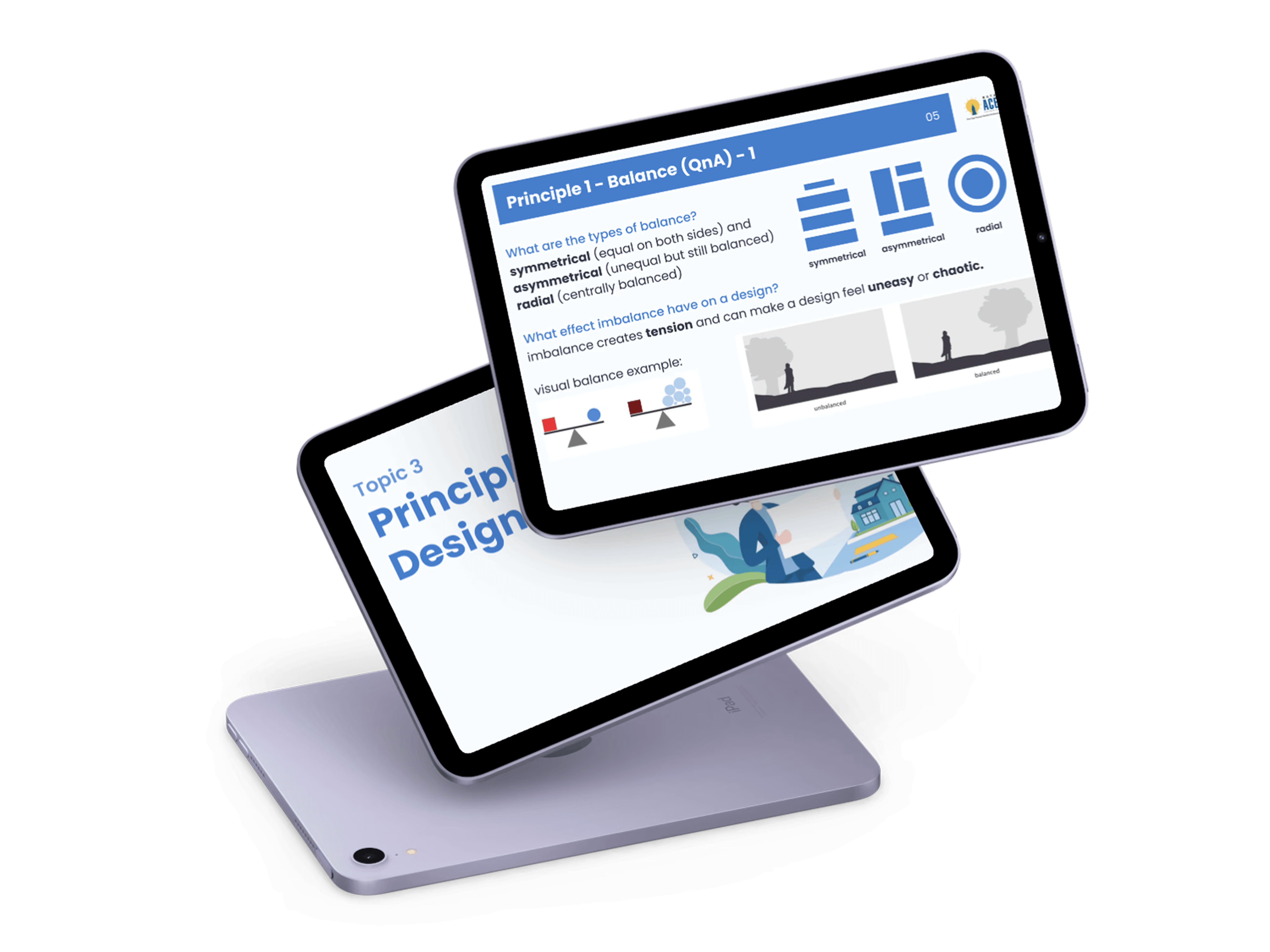
The same topic on a tablet. Reading order and topic number hold at any width.
500 paying students in the first online year, up from 20 in the classroom, at a fifth of the price. Reach hit 2,400+ students against a target of 500.
61% of them finished the course, against a 22% category benchmark, because a student could finally see where she was and what came next.
(From the team)
"Rachana built our entire design system and course herself. The lessons, the slides, the video lectures, everything. She has a way of breaking an idea down so a student actually gets it."
- Ar. Sachin, Founder, Nata Ace Tutorial